

Most businesses assume their contact form works because it successfully sends an email when someone hits ‘Submit.’ Unfortunately, that’s the wrong metric. The real problem is the invisible drop-off—the high percentage of motivated visitors who simply abandon your WordPress lead page before they ever click that button.
Your contact form isn’t just a technical utility; it’s the most critical bottleneck in your sales funnel. You aren’t losing leads because of bad traffic; you’re losing them in the final ten seconds due to poor user experience (UX) and subtle psychological barriers.
As a WordPress Designer and Technical SEO Strategist, my job is to build digital assets that convert. Below are the 5 crucial UX principles I apply to ensure your WordPress lead pages don’t just look good, but actively encourage visitors to reach out.
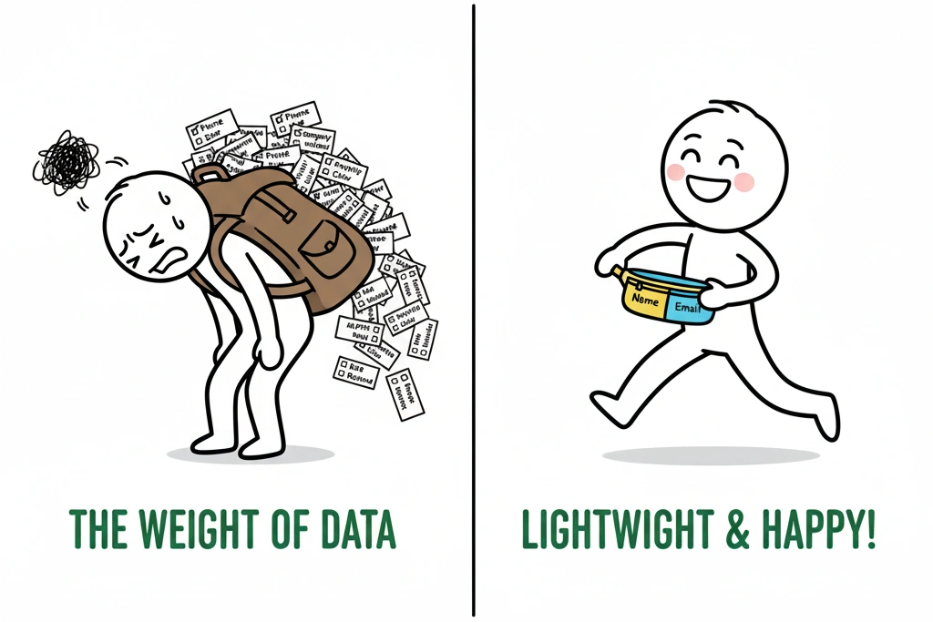
Principle 1: Demand Only What You Need (Minimize Fields)
If you want a higher conversion rate, you must adhere to the principle of minimal cognitive load. Every unnecessary field you add to a form increases friction, and studies consistently show that conversion rates drop significantly after the first three fields.
Actionable Fixes:
- Ask for the Absolute Minimum: For an initial inquiry, you only need Name and Email. If you ask for a phone number, company name, and budget on the first contact, you are essentially asking for a commitment the user isn’t ready to give yet.
- Leverage Conditional Logic: If your project requires complex initial data, use your development skills to implement conditional logic within your form builder. This allows you to hide fields, revealing them only after a user selects a specific option (e.g., “Are you looking for a Quote or Consultation?”). This makes the form look short and simple initially.

Principle 2: Perfect the Microcopy (Labeling and Instructions)
Microcopy refers to the small pieces of text on a website that guide the user—the labels, tooltips, and button text. Generic microcopy is one of the fastest ways to confuse a user and sabotage conversion.
Actionable Fixes:
- Clear, Precise Labels: Avoid vague labels like “Subject.” Instead, use “What is your project goal?” or “Your First and Last Name.” Clarity eliminates the user’s need to guess what you expect.
- Stop Using Placeholders as Labels: Placeholders are the light gray text inside the form field that disappears when the user clicks. While they save space, they increase the memory load, forcing users to remember what the field was for after they start typing. Always use persistent, outside-the-box labels.
- The Power of the CTA Button: Never use the word “Submit.” It is dull, generic, and offers no value. Change the button text to reflect the benefit the user will receive:
- “Get My Free Audit”
- “Start the Conversation”
- “Book My Discovery Call”
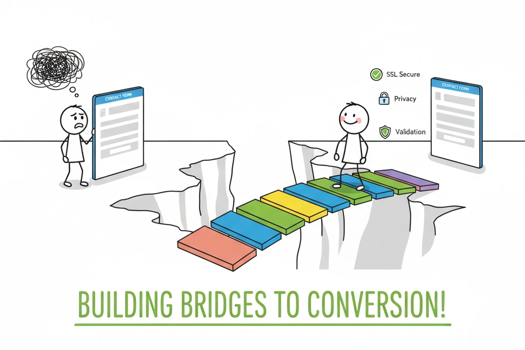
Principle 3: Design for Trust and Clarity (Visual Cues)
A contact form is an invitation to share personal data. If your form looks busy, untidy, or lacks assurance, the user’s psychological alarms will go off, and they will bail.
Actionable Fixes:
- Promote Security Assurance: Place a small, reassuring line of text directly below the form fields, but above the CTA button. This instantly boosts confidence:“We respect your privacy. Your information is 100% confidential and will never be shared.”
- Ensure High Readability: Use sufficiently large font sizes (14px minimum) and ensure high contrast between the field background and the text typed within it.
- Validation is Key: Avoid making users wait until they click the final button to find out they made a mistake. Implement inline validation, which instantly provides feedback (e.g., a green checkmark or a red error icon) as soon as the user finishes typing in a field. This makes error recovery a seamless, immediate process.
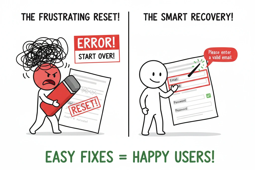
Principle 4: Simplify Error Recovery (The Frustration Factor)
When a form submission fails, the user is already frustrated. A poorly designed error state is often the final straw that causes them to leave your website forever.
Actionable Fixes:
- Preserve Data (Always): If a user clicks ‘Send’ and an error occurs, the form must retain all the information they already typed. Forcing them to re-enter data is a surefire way to lose the lead.
- Be Specific with Error Messages: Don’t rely on generic alerts like “Invalid input.” Your error messages must be crystal clear and point to the exact problem and solution.
- Bad: “Error in Form.”
- Good: “Please enter a valid email address, including the @ symbol.”
- Highlight the Problem Area: Visually emphasize the field that needs correction (e.g., a bold red border around the input box).
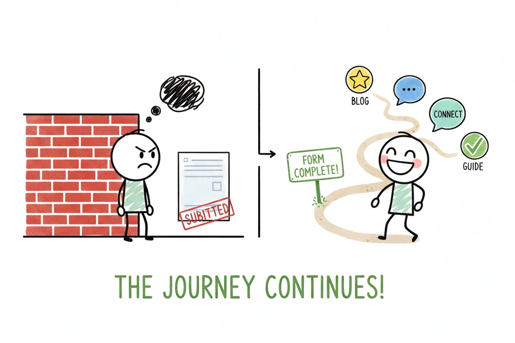
Principle 5: Optimize the Post-Submission Experience
The user has completed the form—congratulations! Now is not the time to stop strategizing. A generic on-page “Thank You” message is a missed opportunity for data tracking and user engagement.
Actionable Fixes:
- Redirect to a Dedicated Thank You Page: This is non-negotiable for professional marketing. Redirecting to a unique URL (e.g.,
/thank-you) allows you to accurately track conversions in Google Analytics and measure the performance of your marketing channels. - Control the Next Step: The Thank You Page should control the user’s flow. Reiterate the next steps and set clear expectations:”Success! We’ve received your request and will be in touch within 24 hours.”
- Provide a Secondary CTA: After setting expectations, offer a soft call to action. You know this user is engaged, so use this chance to deepen their trust:
- “While you wait, check out our recent case study on Website Speed Optimization.”
- “Connect with me on LinkedIn.”
Conclusion: From Failure to Funnel
Your contact form is more than just an input box—it is the final step in your meticulously crafted digital strategy. If your form is failing, it’s not a design flaw; it’s a conversion block. By applying these five principles—minimizing fields, perfecting microcopy, building trust, simplifying error recovery, and optimizing the post-submission experience—you can transform your WordPress lead pages from a frustrating dead-end into a powerful, reliable sales engine.
If you’re tired of guessing why your lead pages are underperforming, contact me for a technical audit of your website’s architecture and conversion funnels. Let’s make sure your forms are truly working for you.
